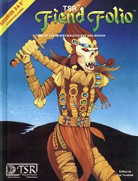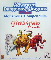
One of my favorite books from the classic D&D era is 1981's Fiend Folio. The main reason I enjoy the book is the artwork; particularly the interior illustrations by Russ Nicholson and Emmanuel's iconic githyanki illustration on the cover. One other thing I've always liked about the book is that it had its own logo; one that was reused for a 2nd Edition Monstrous Compendium Appendix as well. The second version revisited many creatures from the original, with monsters reinterpreted by Tom Baxa.
It seems a lot of British role playing books and magazines from the early '80s were big on hand drawn logos (and lots of them). Installments of the Fiend Factory in early issues of White Dwarf (from which the Fiend Folio was drawn), often had logos for every creature. For the most part they looked like band names scrawled on the back of a notebook in study hall, but that was part of their charm. The D&D Creature Catalogue from 1986 was compiled at TSR's UK offices by Graeme Morris and was illustrated by a number of British artists. Each monster category had a full-page title illustration by Helen Bedford, complete with distinctive logo. This provided the book with a consistent, hand-drawn design aesthetic that harkens back, just slightly, to Medieval bestiaries and Kelmscott Press.

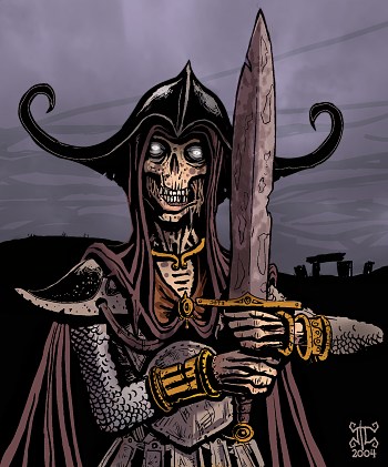
As you may notice, most of the monster entries on this site fall mainly into two categories: undead and Lovecraftian abominations. Other categories will be represented in the future, but what can I say? I draw what I like.
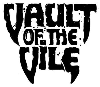
Inspired in equal measure by the Fiend Folio, Creature Catalogue and death metal logos, I decided to craft logos for both categories as though they were separate books. Now, I'm a long way from having enough monster entries to fill up one book, let alone two, but I'm not going to let that stop me from designing logos for them. In fact, having logos gives each category a "brand" to fall under and provides me with additional inspiration to generate content. One of my design goals was that the letterforms in each logo should be based on type available in late '70s or early '80s without specifically aping any publisher's aesthetic.
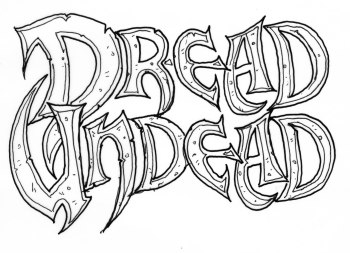
Undead fall under the self-explanatory title Dread Undead. Here's a preliminary logo for it, with hand-drawn lettering inspired loosely by the title of Frank S. Robinson's brutal pseudo-historical sword and sandals epic Children of the Dragon. The letterforms were too '70s fantasy cool for me to resist, though I did make them sharper and more menacing overall, with blade-like forms no doubt reflecting the subliminal influence of the Obituary logo.

Abominations get filed under Vault of the Vile (what can I say, I like alliteration). The hand-drawn lettering in this case is inspired by of the font used for Imagic video game cartridges, such as Demon Attack. For some reason the original font looks otherworldly; with odd, rounded, organic shapes that seem appropriate for a book about abominations from beyond time and space.
