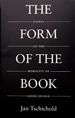
 Inspired equally by reading "The Form of the Book" by Jan Tschichold, learning the typesetting language LaTeX and flipping through some beautifully designed children's books from the '70s, I'm moving forward with my long-standing goal of designing a monster book of the actual printed variety.

I had put together a layout for the book a few months back and mothballed it. After reading Tschichold's book, I was inspired and ditched my original, cramped layout in favor of a design inspired by the canons of page construction.
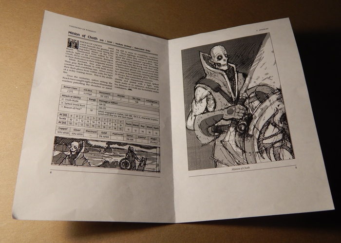
Since a monster book contains a lot of disparate information (text, tables and images), I decided to limit each monster entry to two-page spreads, with text and tables on the left page and the image on the right. Once this template is finalized, I'll have a consistent (though flexible) grid structure to hang content on. For example, I now know that each monster entry should be 200 - 250 words long to fit within the allotted space. The above image is a half size mock up that I printed out to see how the pages would work in an actual spread. The template is still a work in progress.